Porch to Foyer: Designing One Continuous Entrance Story
Most homes greet you twice, and the two hellos rarely match. A strong porch and foyer design treats both spaces as one continuous entrance instead of two unrelated ones. Choose two or three threads — a material, a color, a light temperature, or a shape — and carry them from the porch straight through the front door. In practice, that means four things. Echo one texture from the porch inside — wood, woven fiber, or a terracotta tone. Match the anchor piece on each side: a bench outside, a console or mirror inside. Use warm-temperature bulbs on both sides of the door so the light doesn’t visibly seam. And clear whatever sits on the direct sightline from the sidewalk through the open door — usually the single highest-leverage fix in the whole sequence. Get those few things aligned and a visitor stops noticing two separate design decisions. They start noticing one good one.
Why Your Entrance Reads as Two Different Houses
Walk up to most homes and you’ll notice the split immediately. The porch is warm and textured — wicker, terracotta, a faded runner — and then the door opens onto cool white walls, a glossy console, and lighting that feels like it belongs to someone else entirely. It’s not that either space is wrong on its own — it’s that nobody planned the handoff between them. The eye registers the change even if the homeowner never consciously designed for continuity, and that split-second dissonance is what makes an otherwise nice entrance feel unfinished.
This happens because porch decor and foyer decor are almost always shopped, planned, and styled at completely different times, often seasons apart, by someone thinking about two separate problems: curb appeal outside, first impression inside. Nobody’s stitching them together. The fix isn’t matching everything — matchy-matchy reads as try-hard — it’s choosing two or three threads that carry through the threshold: a material, a tone, a light quality, or a shape.
Start Outside: The Porch Sets the Palette
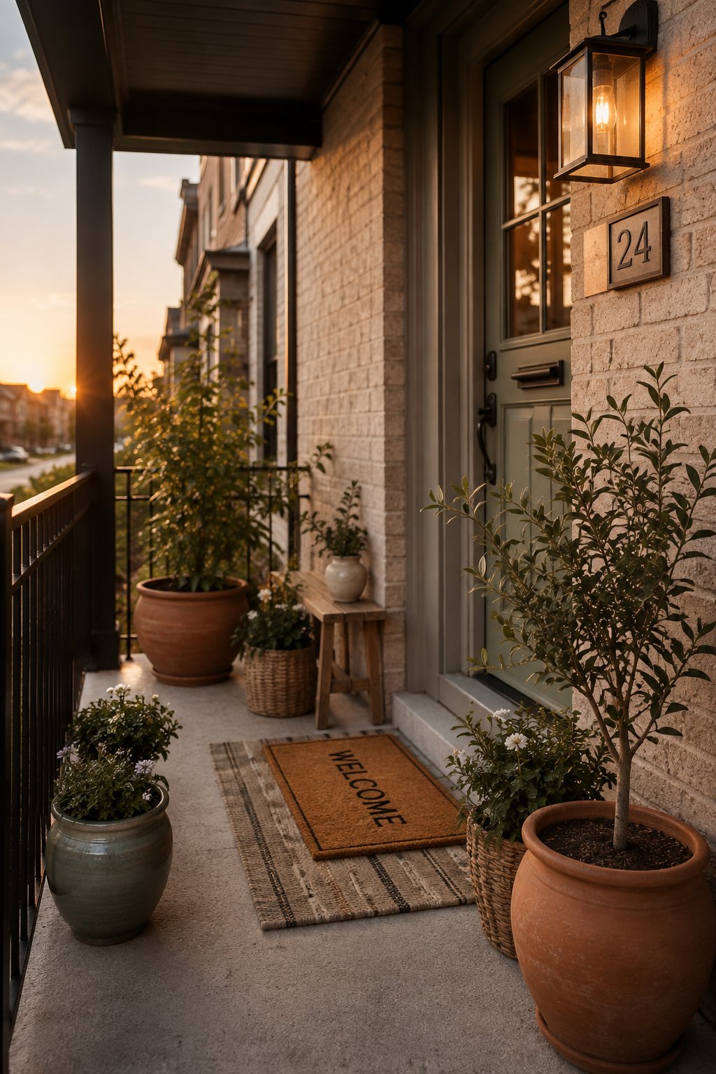
The porch is doing more design work than most people give it credit for. It’s the first material conversation your house has with a visitor. In 2026 that conversation is leaning warmer and more layered than the crisp, single-note porches of a few years back. Think mixed planters instead of matching pairs, a console-height surface instead of bare steps, and lighting treated as an actual fixture choice rather than an afterthought builder-grade bulb. Design coverage this year keeps landing on the same point from different angles. A porch with one deliberate anchor and a couple of well-chosen textures reads as considered. A porch with ten small matching accents just reads as decorated. If your planters are doing the heavy lifting, pairing what’s in them with genuinely low-maintenance, climate-suited planting keeps the look intact past the first few weeks, instead of fading by August.
Color and Material Continuity
Pick one material from the porch and let it walk through the door with you. Say your porch leans into natural wood and woven texture — a teak bench, a jute mat, rattan planters. Carry one of those textures into the foyer through a console leg, a woven tray on the entry table, or a wicker-adjacent light fixture. If your palette outside is warm neutral and terracotta, echo it inside with a rug runner or a single ceramic piece rather than repainting an entire wall. The goal is one recognizable thread, not a themed matching set — the same restraint that makes curated maximalism feel intentional instead of cluttered: a few chosen repetitions, not an aesthetic forced onto every surface.
The Anchor Piece Doing the Talking
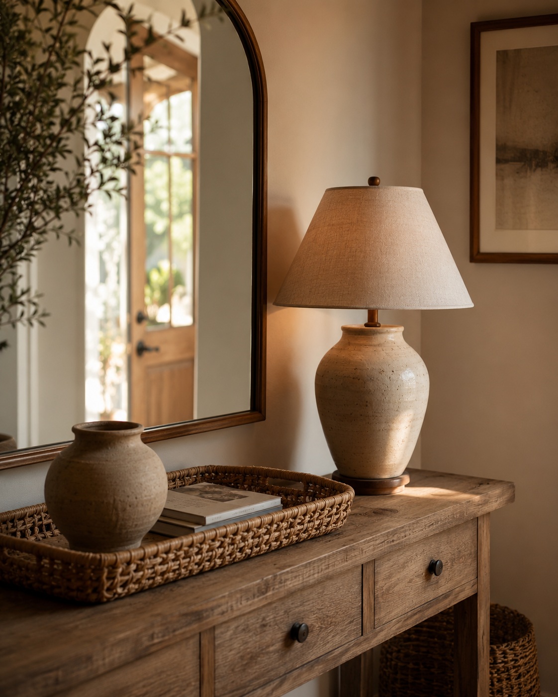
Every strong porch has one piece that isn’t just functional — it’s the visual anchor. A pair of oversized floor planters, a bench with real presence, a door in a considered color. That same logic should repeat immediately inside the foyer with its own anchor: a console table, a statement mirror, or a single sculptural light. The trick is making sure the two anchors are having a conversation, not a competition. Aim for similar scale, complementary warmth, and a shared sense of “this piece was chosen on purpose,” rather than pieces that fight for attention or, worse, ignore each other completely.
The porch is a promise. The foyer is where you keep it.
Cross the Threshold: Where Continuity Actually Happens
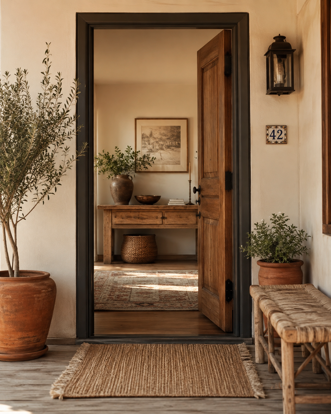
The single most overlooked moment in home design is the three feet on either side of the front door — the actual threshold, where exterior stops and interior starts. Most homeowners design right up to the door and then design again starting just past it, leaving a dead zone in between that neither space claims. That’s the exact spot where continuity has to happen, because it’s the only vantage point where a visitor can see both worlds at once.
Sightlines from the Street to the First Interior Wall
Stand at the sidewalk and look straight through your open front door. Whatever’s visible on that sightline — a wall, a mirror, a piece of art, a hallway runner — is doing more first-impression work than anything on the porch itself. It’s the payoff the porch was building toward, and a blank wall or a cluttered coat hook in that direct line undoes a beautifully styled porch in about two seconds. This is the single highest-leverage fix in the entire entrance sequence, and it costs nothing but rearranging what’s already there. It’s the same instinct behind starting any room refresh at the window rather than the walls: fix the sightline first, then decorate around it.
Lighting as the Connective Thread
Warm-temperature bulbs (2700K–3000K) on both sides of the door do more to unify a porch-to-foyer sequence than almost any decor decision. Mismatched light temperature — a cool white porch sconce against a warm interior pendant, or vice versa — creates a visible seam even when every other design choice is right. Swapping a porch fixture typically runs $150–$400 CAD installed for a mid-range option, and it’s one of the few changes that improves the space at every hour of the day rather than just in daylight photos. It’s also become its own trend line: 2026’s outdoor living coverage keeps circling back to porch lighting as a fixture choice rather than an afterthought, which tracks with what’s happening at the door.
The Small-Space Version
Ontario’s townhome and narrow-lot stock — plenty of it here in the Kitchener-Waterloo corridor — makes this continuity trick more valuable, not less. Compact porches and tight foyers have zero room for two competing design stories; whatever doesn’t earn its place gets noticed immediately. In a smaller footprint, an arched mirror just past the door earns its keep twice over — it bounces porch light deeper into the entry and visually widens a narrow hallway. Pair it with a slim console that shares a material with the porch bench, and the sequence stops feeling cramped. A 21-foot-wide townhome lot with a two-step porch and a four-foot-deep foyer, for instance, has no room for a bulky console at all. A wall-mounted shelf with a single hook rail does the same anchoring job at a fraction of the footprint, and it repeats the porch’s wood tone without eating into the walking path. Vertical elements matter more here than in a grand foyer — a tall single plant, a vertical panel of art, a pendant instead of a flush mount. They draw the eye up and past the actual square footage. For the rest of the room past the entry, the same logic behind maximizing a small footprint applies: scale down the furniture, not the ambition.
What Most People Get Wrong
The instinct, once someone notices the porch-foyer disconnect, is to overcorrect — matching the welcome mat to the entry rug, buying a coordinating set of everything, forcing one aesthetic to dominate both spaces completely. That reads as decorated rather than designed. The homes that get this right usually share only two or three quiet threads between porch and foyer, not ten obvious ones, and they let each space still feel like itself. Continuity is a conversation between two rooms, not one room pretending to be two.
The other quiet mistake is treating this as a one-time styling project instead of a seasonal one. A porch-to-foyer sequence that felt cohesive in June — light linen, pale wood, airy greenery — will feel disconnected by October if only the porch gets refreshed for fall and the foyer never does. The two spaces need to be updated together, even if the update is as small as swapping a runner and a planter liner, or the seam reappears every time the season turns. Here’s a five-minute version of that habit. When you swap the porch wreath or planter for the season, swap one small foyer element in the same breath — a runner, a tray liner, a candle scent — so the two spaces keep aging together instead of drifting apart.
Get the threshold right and something small happens: guests stop noticing the design at all, which is exactly the point. The best entrances don’t announce themselves — they just feel like walking further into the same good idea.
A house is judged the moment someone steps toward it, and forgiven the moment they feel at home inside it. The best entrances make that gap disappear.
— NestDigest