How to Choose Paint Colors for Your Home That Actually Add Value (2026 Guide)
Knowing how to choose paint colors for your home is one of the highest-return decisions you can make as a homeowner in 2026 — and it almost never requires repainting four walls. Whether you are refreshing a space you love, preparing a property for sale, or working within a rental budget, the smarter move is to use color in smaller, more deliberate doses. A single well-placed quart of Benjamin Moore or Sherwin Williams paint — on a shelf interior, a kitchen island, or a doorframe — can shift how an entire room feels, photographs, and sells.

This article is a deep-dive companion to our spring 2026 room design guide, which outlines seven designer-approved moves for refreshing any space. Here, we focus entirely on one of those moves — color in smaller, smarter doses — because it is the one most people misread, and the one with the most financial upside when done right.
Why the “Accent Wall” Idea Has Run Its Course
The accent wall had a long run. For most of the 2010s, it was the go-to answer for anyone who wanted personality in a room without committing fully. One wall, painted a contrasting color, usually behind the sofa or the bed. It worked. And then it was everywhere. And then it started to feel like a design shortcut rather than a design decision.
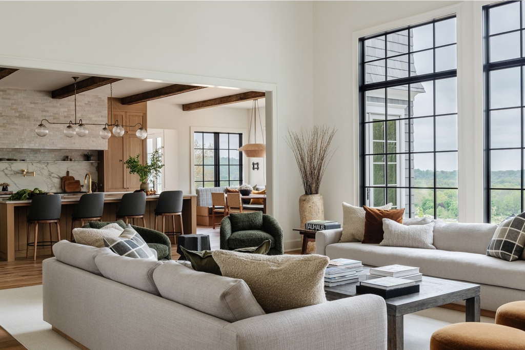
What designers are doing now is more interesting and more effective. Instead of one big moment of contrast, they are spreading personality through smaller, unexpected placements — the back of a bookshelf, the interior of a doorframe, the underside of stair risers, the kick plate of an island. These are places where color lives quietly until you notice it, and then it makes you smile. That is a different emotional effect than a feature wall, and it is a far more sophisticated one.
For homeowners thinking about resale or staging, this distinction matters financially. A bold accent wall can polarize buyers. A well-placed detail — a painted shelf interior in October Mist Benjamin Moore, a doorframe in a rich earthy green — reads as thoughtful and curated without asking anyone to commit to a personal preference they may not share.
The Best Neutral Paint Colors to Anchor a Room in 2026
Before you add color anywhere, you need a solid neutral base. This is where Benjamin Moore and Sherwin Williams paint colors earn their reputations year after year. In 2026, the shift is firmly away from cool grays and toward warmer, earthier tones that feel more human and more livable. These are the colors coming up consistently in both professional recommendations and resale market data.
Warm, versatile tan that bridges traditional and contemporary kitchens. Pairs beautifully with white oak cabinets.
Soft sage with gray undertones. Ideal as a shelf-back, niche, or vanity accent that reads calm and intentional.
The classic soft white. Slightly warm undertone keeps it from feeling clinical. Consistent top resale performer.
The most popular greige in North America. Warm beige-gray balance that works with nearly any fixed finish.
Warm, creamy white that reads rich both in person and in listing photos. Top choice for off white kitchen cabinets.
The perfect in-between shade. Not too gray, not too beige. Broadly safe, broadly attractive, and broadly loved.
Where Smaller Doses of Color Work Hardest
The beauty of targeted color use is that it gives you creative confidence without financial risk. You are not committing an entire room to a shade you might regret in two years. You are making small, reversible, high-impact choices. Here is where those choices do the most work.
Inside Shelving and Bookcases
Paint the back panel of a bookcase or built-in shelf in a contrasting shade and the whole piece of furniture becomes a design feature. A warm mushroom tone at the back of white shelving reads as sophisticated warmth. A deeper sage at the back of natural oak shelving feels grounded and intentional. Benjamin Moore October Mist has become a go-to choice for exactly this application — soft enough to feel calm, distinctive enough to feel deliberately chosen.

Door Frames and Interior Trim
A doorframe painted in a contrasting shade — darker or lighter than the surrounding wall — pulls the eye in a way that makes a hallway feel considered and well-composed. This works particularly well in older homes where the architectural detail is already there and just needs highlighting. Sherwin Williams paint colors like Evergreen Fog or a soft charcoal on trim can completely change how a room reads without touching a single wall surface.
Kitchen Island Contrast
Two-tone kitchens have moved from trend to standard, and the smartest version keeps upper cabinets in a safe neutral — off white kitchen cabinets in Alabaster or White Dove — while introducing personality on the island. This gives buyers the best of both worlds: clean, timeless uppers and a memorable accent below.
If you have white oak cabinets in the kitchen already, a painted island in deep navy, warm hunter green, or bold terracotta creates a farmhouse kitchen feel that photographs beautifully and reads as bespoke when buyers walk through. This is where the two-tone idea adds real financial leverage at relatively low cost.

Bathroom Niches and Vanity Interiors
A shower niche painted in a richer tone than the surrounding tile surround is one of the most effective small-dose color moves in any bathroom. It costs almost nothing — just the price of a small can of moisture-resistant paint — and it creates an effect that looks spa-like and intentional. The same logic applies to the inside of a medicine cabinet or the back wall behind a floating vanity.
Painted Ceilings — Done Quietly
A ceiling painted two shades deeper than the wall color wraps a room in a way that standard white ceilings simply cannot match. This is not about going bold. A barely-there blush in a bedroom, a soft greige on a dining room ceiling — these choices are subtle enough that guests may not immediately identify what feels different. They just feel something. That intangible “this room feels finished” quality is what designers are chasing, and a quietly painted ceiling delivers it every time.
“The rooms that feel most alive are not the ones painted in the boldest colors — they are the ones where someone figured out exactly where color would do the most work with the lightest touch.”
Color and Farmhouse Kitchens: Getting the Balance Right
Few spaces are more color-sensitive than the kitchen, and that sensitivity is even higher in farmhouse-style spaces where the goal is warmth and character without heaviness. Whether you are working with a rustic farmhouse kitchen aesthetic or a more polished modern farmhouse look, color decisions here carry real weight — both aesthetically and at resale.
The farmhouse kitchen design trend that has aged best leans on warm neutrals, natural wood, and one or two moments of personality rather than all-over statement color. Think off white kitchen cabinets with butcher block or quartz countertops, open shelving in natural oak, and a farmhouse kitchen island in a deep, earthy tone. Add farmhouse kitchen curtains in unlined linen and you have a space that feels genuinely warm rather than trend-chasing.
For those working with stock IKEA kitchen cabinets, paint is often the fastest way to elevate a standard configuration into something that looks truly custom. A two-tone approach — keeping upper doors in a soft white and painting lower doors or the island in a contrasting neutral — transforms a budget kitchen into something that reads as deliberate and designed without requiring a full renovation investment.

What the Numbers Actually Say About Paint Color and Home Value
Understanding how to choose paint colors for your home is not purely an aesthetic conversation. For anyone thinking about resale value, rental appeal, or market preparation, color choices carry measurable financial consequences. The good news: strategic color use is consistently one of the highest-ROI home improvements available, requiring far less capital than structural renovations.
Color Upgrades by the Numbers — 2026
Sources: Houzz Kitchen Study 2026, Zonda Cost vs. Value Report, HomeLight, Remodeling Magazine
The pattern in that data is consistent: color decisions that feel low-stakes carry significant financial upside. A weekend project painting kitchen cabinets in Benjamin Moore Advance or Sherwin Williams Emerald Urethane — in a warm off white or a carefully chosen accent tone — can deliver returns that rival far more expensive renovations.
The caution in those same numbers is equally clear. Bold, purely personal color choices — a bright red kitchen, an all-over saturated navy bedroom — can reduce buyer interest and perceived value. The sweet spot, confirmed across every major 2026 study of design professionals, is warm neutrals as the base with one or two disciplined moments of personality.
How to Choose Paint Colors for Your Home: A Practical Framework
Most people approach paint color selection the wrong way — a tiny chip under store lighting, a three-minute tape test on the wall, and a decision made before the light has had a chance to change once. That process leads to a lot of expensive regret. Here is a more reliable approach that professional stagers, designers, and experienced flippers use.
- Start with your fixed finishes. What color are your floors, countertops, and major appliances? Your paint choices should respond to those, not compete with them. Warm wood tones call for warm paint. Cool stone wants a slightly cooler or more balanced palette.
- Test in real conditions. Tape a large sample — at least A4 size, ideally larger — directly on the wall. Look at it in morning light, afternoon light, and under your artificial lighting at night. A color that looks perfect at noon can look completely different at 7pm under warm LED light.
- Understand undertones. Every neutral carries an undertone — pink, green, yellow, or blue. Edgecomb Gray pulls warm beige in certain lights. Manchester Tan goes creamy in south-facing rooms. Knowing the undertone of your shortlisted colors prevents the most common and frustrating paint mistakes.
- Use the 60-30-10 rule. Sixty percent of a room in your dominant neutral, thirty percent in a secondary shade or material, and ten percent in an accent color. That ten percent is exactly where smaller doses of color live — and where they do their best work.
- Order peel-and-stick samples. Both Benjamin Moore and Sherwin Williams offer large-format peel-and-stick samples you can reposition around the room. Far more accurate than a paint chip and well worth the small cost before committing to gallons.
- Think about room flow. In open-plan homes or connected rooms, colors need to talk to each other. Test adjacent spaces at the same time rather than deciding room by room in isolation. A neutral that works perfectly in the hall can look flat or clashing once it meets the living room light.

Think Like a Colorist: The Art of Intentional Placement
There is a reason the best hair colorists — the balayage specialists who have spent years mastering painted highlights — do not bleach an entire head of hair. They find where the light naturally falls, and they work with it. The effect looks sun-kissed, organic, and effortless, even though it required real skill and intention to create. The technique works precisely because it is restrained.
Interior color strategy works the same way. The rooms that look best are not the ones where someone painted every surface a strong color. They are the rooms where someone figured out where the light falls, where the eye naturally travels, and where a moment of contrast or warmth would feel genuinely earned. The shelf interior that catches the afternoon light. The doorframe at the end of a hallway that draws you forward. The island in a kitchen that anchors the whole room.
Whether you DIY with a quality Benjamin Moore or Sherwin Williams paint and a good brush, or bring in a professional for a flawless sprayed finish, the principle is identical: place color where it will do the most work with the lightest possible touch. That restraint is what separates rooms that feel designed from rooms that just feel painted.


Making It Last: Paint Products and Application Tips
Small-dose color only works if it looks intentional and well-executed. A sloppy application on a shelf interior looks noticeably worse than no paint at all. The right products and the right technique make the difference between a professional result and one that draws attention for the wrong reasons.
- Use cabinet-grade paint for high-contact surfaces. Benjamin Moore Advance and Sherwin Williams Emerald Urethane Trim Enamel are the professional-grade choices for cabinets, shelving, and trim. They cure hard, wipe clean, and resist chipping in ways standard wall paint simply cannot match.
- Prime properly — especially on oak. Clean surfaces, lightly sand with 220-grit, and prime before painting. On any surface with tannin content — oak cabinets, older wood trim — use a shellac-based primer like Zinsser B-I-N to prevent bleed-through and adhesion failure.
- Two thin coats beat one thick one every time. Let the first coat dry fully before applying the second. Rushing produces brush marks, drips, and uneven coverage that no amount of touching up will fully fix.
- Foam roller for flat surfaces, quality brush for edges. This combination produces the smoothest possible finish on cabinet doors and shelf interiors without spray equipment, and it is achievable for any careful DIYer.
- Wait the full cure time before cleaning. Water-based alkyd paints like Benjamin Moore Advance are dry to the touch within hours but take up to 30 days to fully cure. Treat newly painted surfaces gently through that first month — no harsh cleaners, no heavy objects resting against the finish.
The Takeaway: Less Commitment, More Character, Real Returns
The rooms that feel most alive are rarely the ones painted in the most assertive colors. They are the ones where color was placed thoughtfully — where a considered decision was made about which surfaces deserved contrast, which ones should carry warmth, and which ones should stay quiet so the others could speak.
For anyone working through a home upgrade — whether for personal enjoyment, sale preparation, or rental income — smaller doses of color are almost always the smarter strategy. The financial investment is low. The impact on how a space looks, feels, and photographs is high. And the risks, when you stay within a warm neutral palette and place your accent moments deliberately, are minimal.
The best neutral paint colors — Manchester Tan Benjamin Moore, White Dove, Alabaster, October Mist Benjamin Moore, Edgecomb Gray, Agreeable Gray — give you a beautiful, market-tested base. And the accent choices, placed exactly where they earn their keep, give a home the kind of personality that people remember: when they are deciding whether to make an offer, sign a lease, or simply never want to leave.
That is what smart color does. It makes a room feel like someone lives there — and loves it.
Frequently Asked Questions About Choosing Paint Colors
How do I choose the right paint color for my home?
Start by identifying your fixed finishes — flooring, countertops, and existing cabinetry. Your paint colors should respond to those tones rather than compete with them. Warm wood floors pair well with warm neutrals like Manchester Tan or Agreeable Gray. Cool stone surfaces can handle slightly cooler or more balanced shades. Always test a large sample directly on the wall and observe it in different lighting conditions — morning light, afternoon sun, and evening artificial light — before committing to a full can.
What are the best neutral paint colors for resale value in 2026?
The top-performing neutral paint colors for resale in 2026 are warm whites and greiges rather than cool grays. Benjamin Moore White Dove OC-17, Edgecomb Gray HC-173, and Manchester Tan HC-81 consistently rank among the best performers. From Sherwin Williams, Alabaster SW 7008 and Agreeable Gray SW 7029 are the most recommended by real estate agents. These shades appeal to the widest range of buyers, photograph well in listings, and rarely require repainting by incoming owners.
What is Benjamin Moore October Mist and where should I use it?
October Mist 1495 is a soft, muted sage-green with gray undertones from Benjamin Moore’s 2021 Color of the Year collection that has remained popular into 2026. It works best in small doses — the back of a bookcase or built-in shelf, a bathroom niche, or a painted vanity — where its subtle green quality adds warmth and personality without overwhelming a room. It pairs well with warm whites like White Dove, natural wood finishes, and aged brass hardware.
What paint color is best for kitchen cabinets for resale?
For maximum resale appeal, off white kitchen cabinets in Benjamin Moore White Dove or Sherwin Williams Alabaster consistently outperform stark bright whites and bold colors. These warm whites feel fresh and clean without looking cold or clinical. For a two-tone kitchen, keep upper cabinets in one of these whites and introduce an accent color on the island only — navy, forest green, or a warm greige. This approach adds personality while keeping the space broadly appealing to buyers.
Does painting kitchen cabinets really increase home value?
Yes — cabinet painting is one of the highest-ROI home upgrades available. According to 2026 data from the Zonda Cost vs. Value Report, a minor kitchen remodel including cabinet painting returns an average of 113% of the investment. A $2,500 cabinet refresh can add an estimated $5,000 to $7,000 in resale value in most markets. The key is choosing the right color — warm neutrals and off whites consistently outperform bold personal choices in buyer appeal.
What is Manchester Tan by Benjamin Moore and is it still popular in 2026?
Manchester Tan HC-81 is one of Benjamin Moore’s most enduring neutral paint colors — a warm, medium-depth tan that reads as a classic beige with a slightly golden undertone. It remains popular in 2026, particularly in traditional kitchens, living rooms, and hallways where a grounded, warm neutral is needed. It pairs well with white oak cabinetry, antique brass hardware, and natural linen textiles. It performs best in rooms with warm or south-facing light; in north-facing rooms, it can pull slightly yellow, so test carefully before committing.
How do I use color in a farmhouse kitchen without it feeling overdone?
The most enduring farmhouse kitchen designs use color in one or two strategic spots rather than all-over. Keep upper cabinets in a warm white like Alabaster or White Dove, use natural white oak or wood open shelving, and introduce one accent color on the island only. Good farmhouse island colors include Sherwin Williams Evergreen Fog, a navy blue, or a soft terracotta. Add linen farmhouse kitchen curtains in natural or warm white, and use aged brass or matte black hardware to tie it together. The result feels warm, personal, and broadly appealing without becoming theme-like.