
2026 Fall Color Palette: Burgundy, Mustard & Oxblood for Canadian Homes
The 2026 fall color palette for the home has moved decisively away from the muted terracottas and pumpkin oranges of the last few years and into deeper, more saturated territory: burgundy, mustard, and oxblood. Burgundy is a warm, wine-toned red softened with brown and violet; oxblood pushes further into brown-black leather tones with almost no brightness left in it; mustard is a muted, spice-rack yellow that reads earthy rather than cheerful. Across Canadian homes, these colours are showing up as accent walls in powder rooms and home offices, velvet and mohair upholstery, ceramic lamps, and wool textiles — not an all-over repaint. Part of the appeal is practical: a saturated colour hides wear through a long winter better than a pale one ever could.
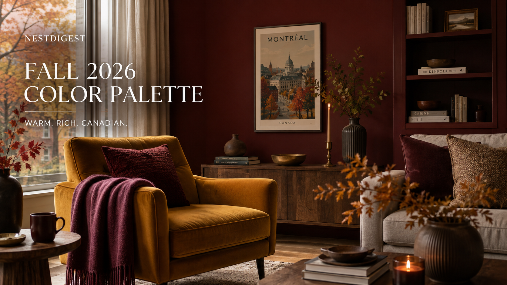
Burgundy, mustard, and oxblood layered together in a fall-ready living room corner.
Beige has quietly left the room. Walk into any well-considered Canadian home redecorated this September and you’ll notice the same shift happening across radically different budgets. Walls the colour of good wine. Cushions the shade of a jar of grainy mustard. A leather armchair with the deep, brownish-red cast of oxblood. This is the 2026 fall color palette for the home, and it isn’t a passing seasonal accent the way pumpkin orange was for the last several Octobers. Burgundy, mustard, and oxblood are being treated as structural decisions — the kind homeowners commit to for years, not a cushion swap before Thanksgiving.
The timing isn’t random. After nearly a decade of grey walls, white oak, and studied minimalism, designers are calling this shift toward saturated, brown-based colour a return to something more enclosed and personal — homes that feel private and held rather than open and on display. It tracks especially well here. Canadians spend more consecutive months indoors than almost anyone else in the developed world, and a pale, echoing living room gets a lot harder to defend somewhere around the third week of February. This fall’s palette is, in part, a homeowner finally admitting that.
The three colours get lumped together on moodboards, but they behave differently on a wall. Burgundy sits close to a glass of good cabernet — red with brown and violet folded in, warm rather than cold. Oxblood pushes further into brown, closer to the colour of aged leather than any fruit, and in low light it reads almost neutral. Mustard is the outlier: a golden, spice-toned yellow muted with enough grey or brown that it never tips into cheerful. Benjamin Moore’s own 2026 Color of the Year, Silhouette, leans into this same espresso-and-charcoal register, which is a fair sign the pull toward warm, grounded darks isn’t confined to one brand’s marketing calendar.
The instinct with a colour this saturated is to ration it — one accent wall, one throw pillow, done. Rooms that pull this palette off convincingly tend to do the opposite. Oxblood performs best when it’s committed to rather than sampled: on a powder room’s walls, trim, and ceiling all at once, or across a run of home-office built-ins, so the colour reads as an atmosphere rather than a half-finished thought. If you’re weighing where to start, how a colour choice actually affects resale and everyday livability is worth reading before you commit a whole room to it. Counterintuitively, a small, awkward space with no real focal point is often the better candidate for this treatment than an open-concept great room, where a wall this dark can shrink a space that was already working hard to feel large.
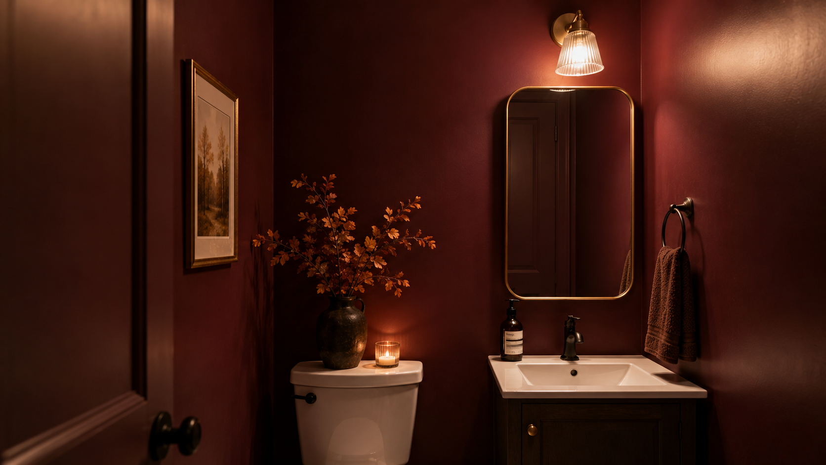
Committing a full small room to oxblood, rather than sampling it on one wall.
There’s a real trap here, and it catches a lot of first-time dark-colour homeowners. A flat, matte burgundy wall can read like a decision made in 1998. The same colour in velvet upholstery, mohair, or a lacquered cabinet reads current instead, because the shift is about surface as much as hue. If you’re painting rather than upholstering, look for an eggshell or pearl finish over dead-flat matte. It catches enough light to keep the colour feeling alive instead of absorbing it into a dark hole in the corner of the room.
Renters don’t get left out of this one. Most standard leases across Canada allow a tenant to repaint with the landlord’s sign-off and a promise to restore the original colour at move-out, which makes a single accent wall a reasonable ask rather than a fight. For anyone who can’t paint at all, the same depth still comes through. A removable peel-and-stick wallpaper in a burgundy or oxblood print, a mustard boucle slipcover over an existing sofa, or one large framed piece of art can do the colour work without touching a wall.
Metal finishes matter more than most people expect against this palette. Warm brass and aged bronze read as a continuation of the mustard and oxblood tones, while chrome or brushed nickel can make the same wall feel colder and slightly at odds with itself. If a full hardware swap isn’t in the budget, even changing the cabinet pulls in a kitchen or bathroom that already leans this direction is one of the cheaper ways to make a room feel finished instead of half-committed.
Mustard carries less risk and earns its keep faster. It doesn’t need four walls to make its case. A velvet dining chair, a pair of ceramic table lamps, or a wool runner down a front hallway does the job at a fraction of the commitment. It’s also the easiest way to test whether this whole richer, more collected style of decorating actually suits how you live before you touch a wall. A mustard throw or a set of lamps in that shade typically runs somewhere between $40 and $150 at most Canadian home stores, which makes it the lowest-risk entry point if oxblood on the walls still feels like a leap.
Where this palette earns its keep hardest is in rooms built around gathering rather than passing through — dining rooms, home libraries, studies, snugs. The dining-library hybrid that’s been showing up in homes across the country this year is practically built for it: dark wood, layered textiles, and a wall colour with enough depth to make a room feel held rather than merely furnished.
A dark room isn’t a smaller room. It’s a room that finally stopped apologizing for the season it’s in.
For anyone weighing an actual repaint, it’s worth budgeting realistically. A gallon of quality interior paint from a major Canadian retailer runs roughly $90 to $130, and a standard bedroom accent wall takes about one gallon with a bit to spare. The cost people underestimate is prep, not paint. Dark colours show every roller mark and patch job, and a wall going from pale neutral to oxblood usually needs a tinted grey primer coat first. Skip it, and the true colour won’t show up evenly until the third coat. The palette also carries well into the months right behind it — the layered lamp light Canadian homes lean on once the days shorten reads noticeably warmer against a burgundy or mustard backdrop than it ever did against grey or white.
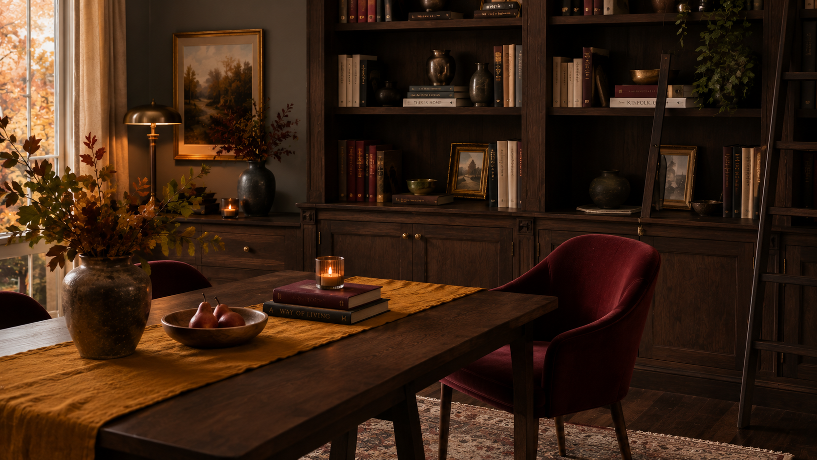
The dining-library hybrid is a natural home for this year’s richest tones.
None of this requires repainting the whole house before the leaves are down. The homes that pull off this fall color palette convincingly usually start small: one room, one real commitment — a wall, a chair, a run of cabinetry. Not colour-matching every room in the house to a moodboard by October. A room that looks like someone made a decision is more memorable than one that looks like it’s still deciding, and burgundy, mustard, and oxblood are, if nothing else, colours that don’t leave much room for indecision.
The colours we choose for a room are just decisions we’ve stopped being afraid to make.
— NestDigest